
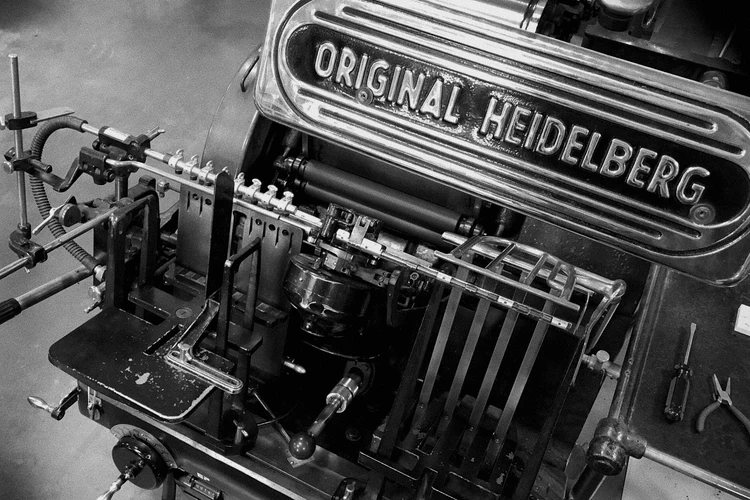
Run a fingertip across a letterpress card and you'll find the answer before any definition arrives: the letters are in the paper, not on it. Letterpress is relief printing — a raised surface is inked and pressed into the sheet with genuine force, leaving both the ink and a physical impression, a shadowed footprint you can feel with your eyes closed. It is the oldest form of printing we have, it ran the world's presses for five hundred years, it very nearly died, and it came back for the most human of reasons. Here's the whole story, and how to tell good letterpress when it's in your hand.
Five centuries in one paragraph
Gutenberg's movable type, around 1450, made letterpress the default technology of the printed word — every book, broadside, and newspaper for centuries was raised metal type, inked and pressed. Through the industrial age the presses got faster and more wonderful (more on our favorite in the Windmill's biography), until offset lithography and then digital printing did to letterpress what letterpress had done to the scribes. By the 1980s the trade was scrap-metal auctions and retired machinists. What survived did so by changing jobs: letterpress stopped being how the world printed information and became how it prints occasions.
The beautiful irony of the impression
Here's the detail that delights printers: the deep, tactile impression that defines modern letterpress — the very thing you're paying for — was considered a defect for most of the craft's history. Old-school printers were trained to "kiss" the paper: ink transfer with no visible bite, because type was expensive and crushing it into the sheet wore it out. The revival inverted the rule. Freed from wearing out metal type (modern shops mostly print from photopolymer plates — light-cured relief plates made from digital artwork, which is how new designs meet a 1950s press), printers could let the machine bite deep into soft cotton stock. The flaw became the signature. Very few crafts get to watch their worst habit become their whole point.
How it differs from everything else
- Digital/offset: ink sits ON the surface, perfectly flat. Crisp, cheap, infinite — and dimensionless. Run your thumb across it: nothing.
- Engraving: the opposite of letterpress — ink is pulled UP out of etched grooves, leaving raised ink you can feel like Braille, with a telltale "bruise" on the card's back. The old-money formal tradition.
- Thermography: raised resin powder heat-fused over wet ink — engraving's shortcut, shiny and slightly plastic to the touch. Honest budget option; not the same animal.
- Letterpress: ink pressed IN. Matte, dimensional, shadow-catching. (The full field guide to pressed, raised, and foiled finishes: deboss vs emboss vs foil.)
Reading a letterpress piece like a printer
Four things the trade looks for: impression depth — deep enough to shadow, not so deep the letterform's back telegraphs through (the paper's job to prevent: heavy cotton bulks and cushions, which is why cotton defines the craft); ink coverage — even and solid within the letterform, no salty speckle; edges — crisp walls where ink meets un-inked paper, the crispness photopolymer does beautifully; registration — multiple colors meeting exactly where the design intended. Tilt the card against a window light: good letterpress casts tiny shadows in its own valleys. That raking-light moment is the whole product.
Why it survived (the actual reason)
Not nostalgia — evidence. A letterpress card carries physical proof that a machine weighing as much as a car was operated by a person, one sheet at a time, on your behalf. In a frictionless feed of weightless messages, the impression is friction you can feel — the difference between being contacted and being considered. That's the trade we're in: pressing that evidence into cotton, sheet by sheet, on a machine with a story of its own — meet the Windmill next, or spend a day in the shop.